Overview
This case study involves changing a core function of the App Annie mobile app navigation, some of the problems and challenges which occured, along with solutions and results after implementation.
Problem
While monitoring app reviews and communicating with users via Zendesk, it become apparent that there was a major navigation problem in the app. Users were mentioning that the App Annie web app had many more features than the native mobile app, and began asking when they would have more feature parity. Many of the requested features were already in the app, but yet users could not find them.
This information lead me to do some research of the app in Google Analytics, to get an idea of screen usage and user flow percentages. It was clear that there was a big drop off on the screens that users were asking for. I realized the main problem was the component used for navigation once viewing a single app. Getting to the single app section from a list view presetned no issues. The first screen viewed once arriving to the single app section was called the "App Details" page. While there were other screens in this section containing more app information, the users were not finding them due to the navigation component.
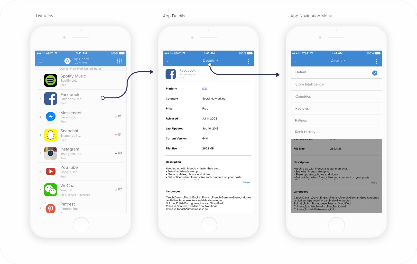
In addition, I never felt the content on these screens was very compelling when I began working on the app. I wanted to update these screens to provide more information, as well as provide a better overall user experience. We were not going to be able to make all the changes at once, so I had to put a plan in place to incrementally change this single app section. Below are a list of problems that I wanted to resolve:
- Make the navigation visible
- Reduce barrier to content
- Improve the single app level user experience
- Address any API constraints for future iterations
Users
The next step for me was to dive in and understand the app users more in depth. What information was going to be more pertinent on the go? What did users need out of the mobile app that they weren't getting on the web app? Our users were mostly comprised of app developers/publishers, venture capitalists, and advertising platforms. We had personas around each of these buckets, by job role and goals. We had a free and paid subscription model, with free users needing more historical App Rank data, and paying customers needing more data to study app competition.
I then spoke with the sales and customer service teams, to get any user feedback they may have received, while gaining some more insight. I matched this data along with what I had found from app reviews, Zendesk tickets and Google analytics. I wanted to find ways to solve the problem, as well as set the app up to be more scaleble in the future. For example, we did not have any data in the app for paying customers, which was a pain point.
Testing
First I set out to test the current app, to be sure that the problem existed where I felt it might. I used Usability Hub to quickly test screens using a "Click Test", to find out what users were doing to try and find the individual app data they were seeking.
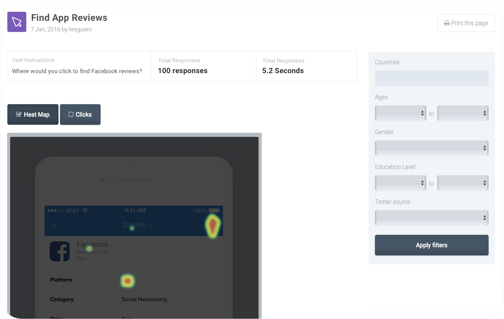
I tested by asking users where they would click to find certain information about an app, and the results were almost identical regardless of the content they were asked to look for. Users were clicking on the "More" icon most often, instead of the text button "Details" in the UINavBar. This confirmed that the UINavBar dropdown component was a barrier to entry. Users were just not able to find the additional screens that were already in this section.
Ideation
Next I set out to start solving the problem. Now that I knew the navigation of this section needed to change, I began thinking of ways to include as much of the content as possible on the initial screen, to add visibility. In addition, I needed to keep in mind additional content, from a Product perspective, that could be added down the line. The solution needed to be scalable and future proof, as well as solve the problem.
Users mentioned that a dashboard would be welcomed, something of a summary nature. Other ideas were to use top navigational tabs, like a Material Design type of pattern. I thought, why not use the native bottom iOS tabs instead? This would work well on iOS, and I could possibly use scrollable tabs on Android. I felt even bottom tabs on Android could work in this situation. I started thinking of how I could divide current and potential content in these sections, and find out how many tabs I might need.
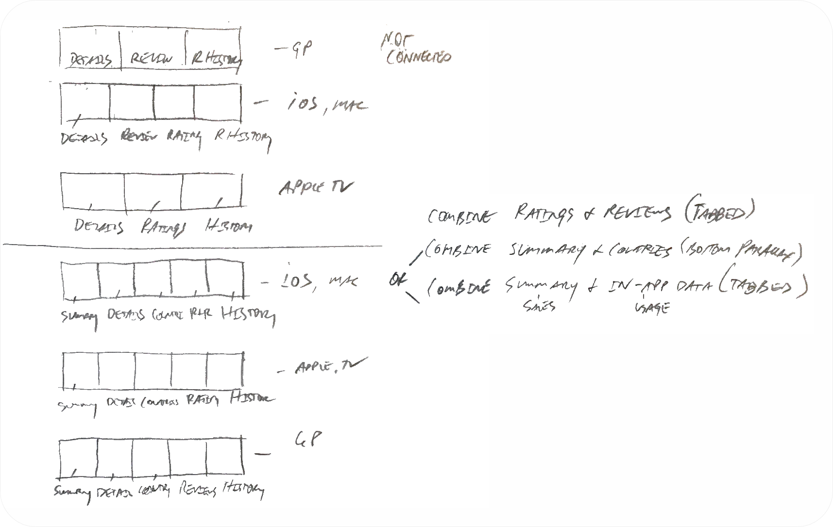
From the sketch above, you can see that just the organization of content posed a great challenge. Initially, this idea was frowned upon. There was just too much content and we hadn't even begun adding anything new. I ran some of these ideas by engineering, and got huge initial cost estimates. I had to find a way to simplify everything.
More Testing
While I loved the dashboard concept, and wanted to re-design these screens, it was too much to do all at once. I parked that idea for the moment, but would come back to it later. I wanted to test the tabs concept with stakeholders, employees, and users. I built some quick prototypes to put on people's phones, so that everyone could feel in their hands what I was proposing. Below are the prototypes, with the one on the left being the original, and the right the proposed solution.
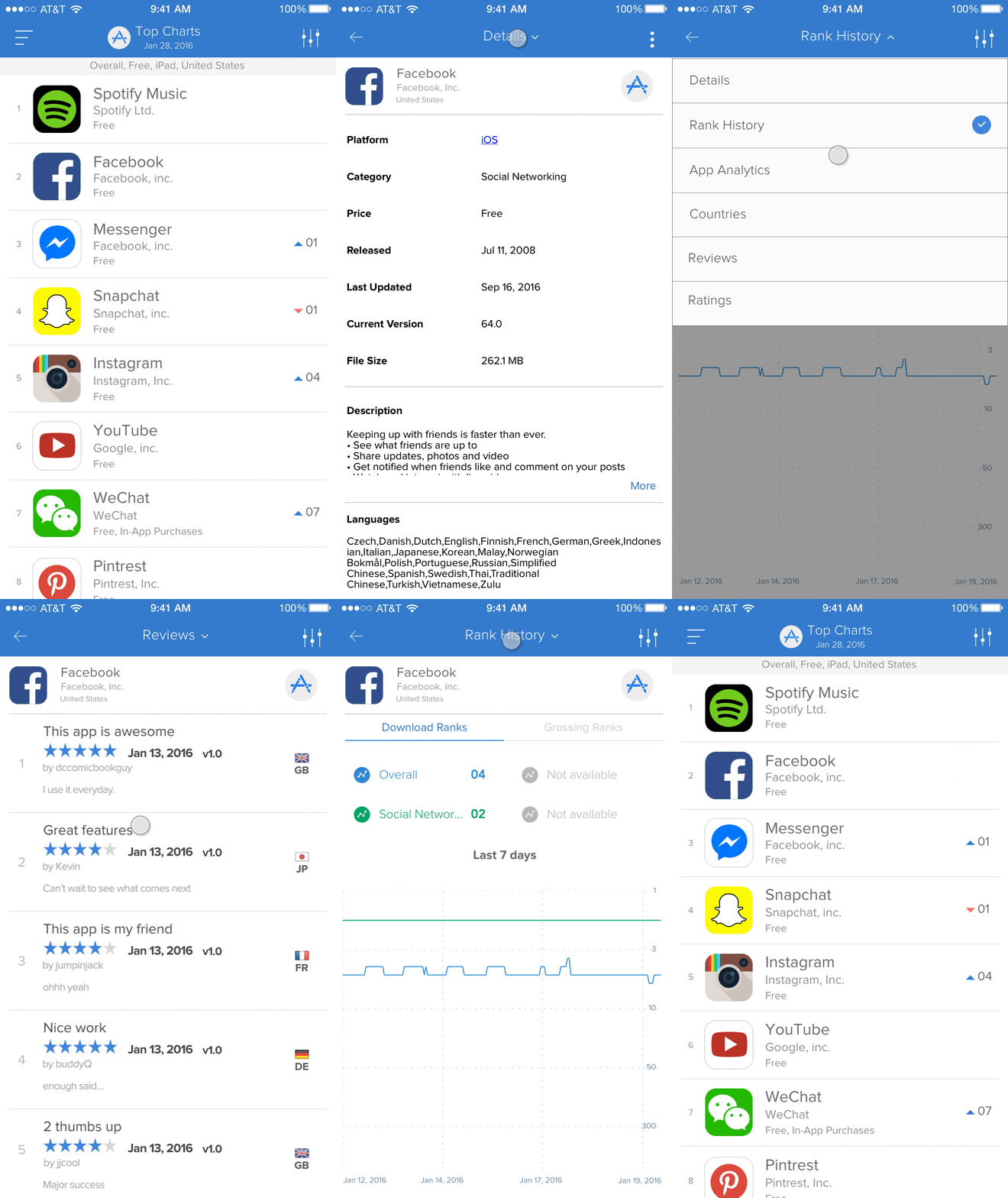
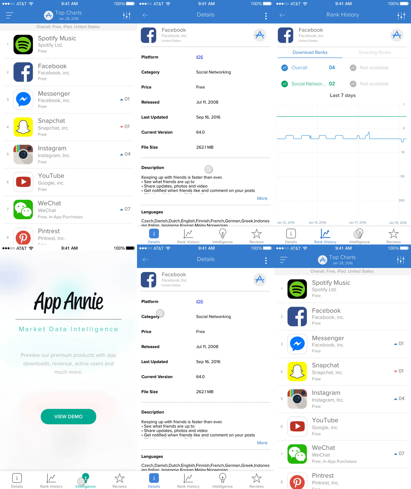
Stakeholders and employees felt the difference, and wanted to move forward. I still needed to test with users, so I then ran a moderated side by side A/B test, with the help of our UX Research team. UX Research was a huge help in recruiting different users, in addtion to help build the right script to gather the correct data we needed. With a build on 2 different phones, users were asked to explore the current vs proposed prototypes. The feedback was 10/10 users preferred the tabbed navigation. Most users (8/10) could still not find the dropdown on the current protoype.
Solution
It was decided to move forward with the project. Little UI work was needed, which helped things move quicker. Tabs needed no specification as they are part of the IDE, so I only needed to provide assets. Moving forward, I planned to tackle some of the other existing problems (Metrics Data by Country, combining Reviews and Ratings). The project was a huge success. Analytics and reviews both showed that users really appreciated the change, and with more visability were now able to find/access the data they needed and wanted.