Overview
This case study involves redesigning the content of the App Annie single app level. The single app level refers to the details view once selecting an app. Changes include feature additions, grouping of information, while upgrading the UI.
Problem
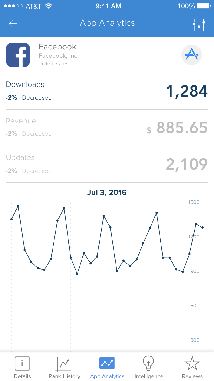
During user testing of the navigation dropdown menu project, it became clear that users felt that the information available while viewing a single app wasn't meeting expectations. Monthly Usage increased after the navigation change, but Daily and Weekly Usage still wasn't moving in an upward trend.
Analytics and Intelligence (Paying Customers) sections only had room for 3 metrics, and the section needed to be scalable to support up to 20 metrics. Reviews and Ratings needed to be combined into one section. Users wanted to be able to see all metrics by country and device like on the web application. Filters were talked about in quite a negative light, with most saying it was too cumbersome to change dates or countries. In addition, users asked for a summary dashboard to make things easier to digest. The App Annie app needed to take a big step forward.
I also never felt the content on these screens was very compelling when I began working on the app. I wanted to update these screens to provide more information, as well as provide a better overall user experience. With engagement and retention being the main focus of this project, I set out to improve the user experience by:
- Grouping relevant content
- Improving web feature parity
- Adding new content
- Creating scalablity
- Improve APIs and their data response
Users
I really needed to go back and review all user responses, and take a look at the personas. A lot of users were requesting features and changes, but I didn't know which may be more important or used more than others. I had an idea, but I needed to start matching up usage with these personas. I found that Ranks by country was the most needed feature. There were also many requests for a dashboard across all personas.
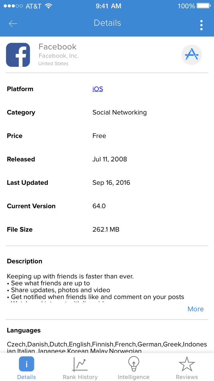
Many mentioned that the "App Details" page provided no important information, as it was just a blob of text. Most of the requests were coming from paying users, who wanted to see more relveant information about competitors while viewing the mobile app. Free users wanted most of the Rank improvments and Dashboard features for their own apps. Free users that weren't developers/publishers were looking for more content overall.
Ideation
Since I had a lot of feedback data from testing the navigation project, I decided to jump right in and start solving these problems. The first one I started with was the "App Details" screen, since it was the first screen people saw, and would make a first impression. I started sketching some ideas, and doing some wireframing to get a feel how it might look.
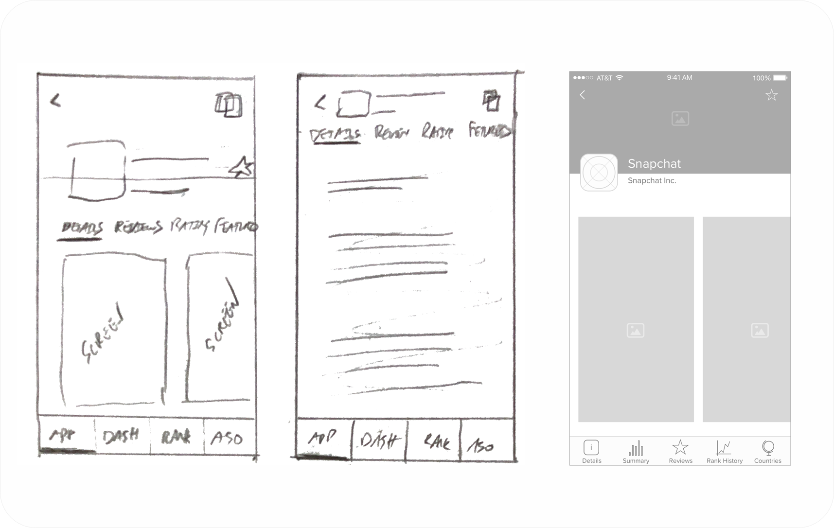
Next I started brainstorming on what a dashboard could look like, and where it could fit. In addition I started thinking about creating a pattern for all the metrics screens, which could be resued and segmented by countries and devices.
I really wanted to have multiple lines on the graphs, which was something we had the capability to do with the charting libraries. The API didn't support this, so I needed to run all these ideas by engineering. We needed to understand cost, and when we might have APIs to deliver charts with mutliple lines representing segmented metric data by country. You can see the dashboard ideas on the left, and the segmented metric charts on the right.
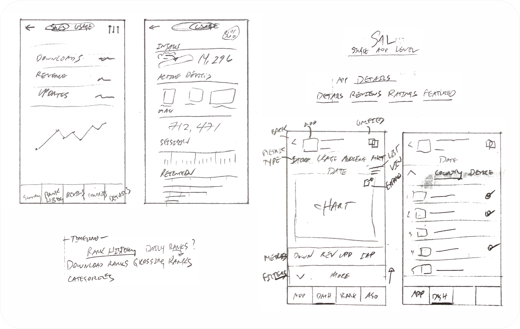
From the sketch above, you can see that the oringnal idea was to have the dashboard on its own screen, separated from details. After many meetings with stakeholders, the decision was made to omit reviews and ratings from the "App Details" screen, but explore adding the summary dashboard there. This would provide a much better experience when landing on an app from a list view. Reviews and ratings were too heavy from a data standpoint to be a segment of the "App Details" screen.
Testing
Engineering was comitted to adjusting the APIs to support the segmented metric chart. The thought on the dashboard was to plan a new summary API that could reused, and that we could add it in to the "App Details" page on a second release, if it tested well. I needed to create some testing materials to get some feedback on this direction, before engineering could commit to work.
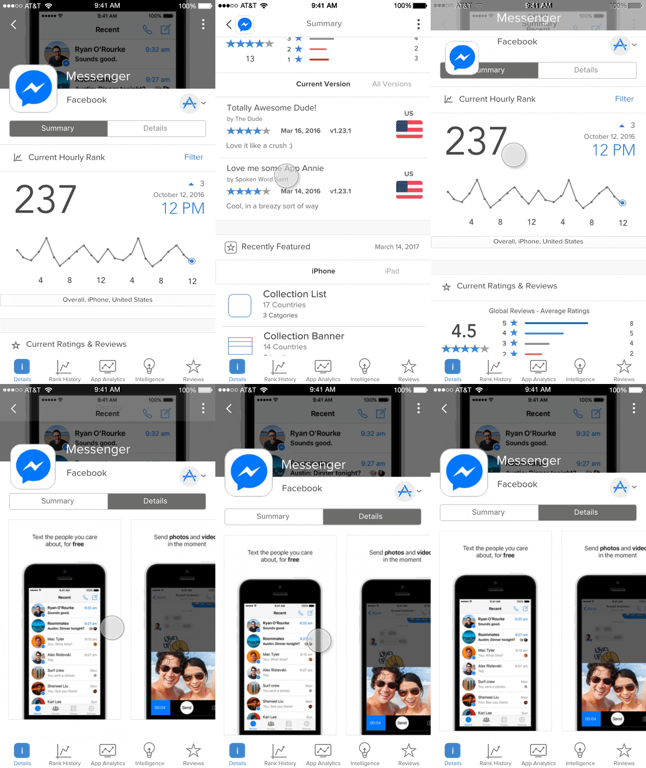
I ran a moderated side by side A/B test with users, with the help of our UX Research team. The feedback was 12/12 users preferred the proposal, while raving about the new dashboard concept. Users offered suggestions as to different types of summary cards that could be added. Stakeholders agreed, and engineering moved forward with planning the new summary API.
More Testing
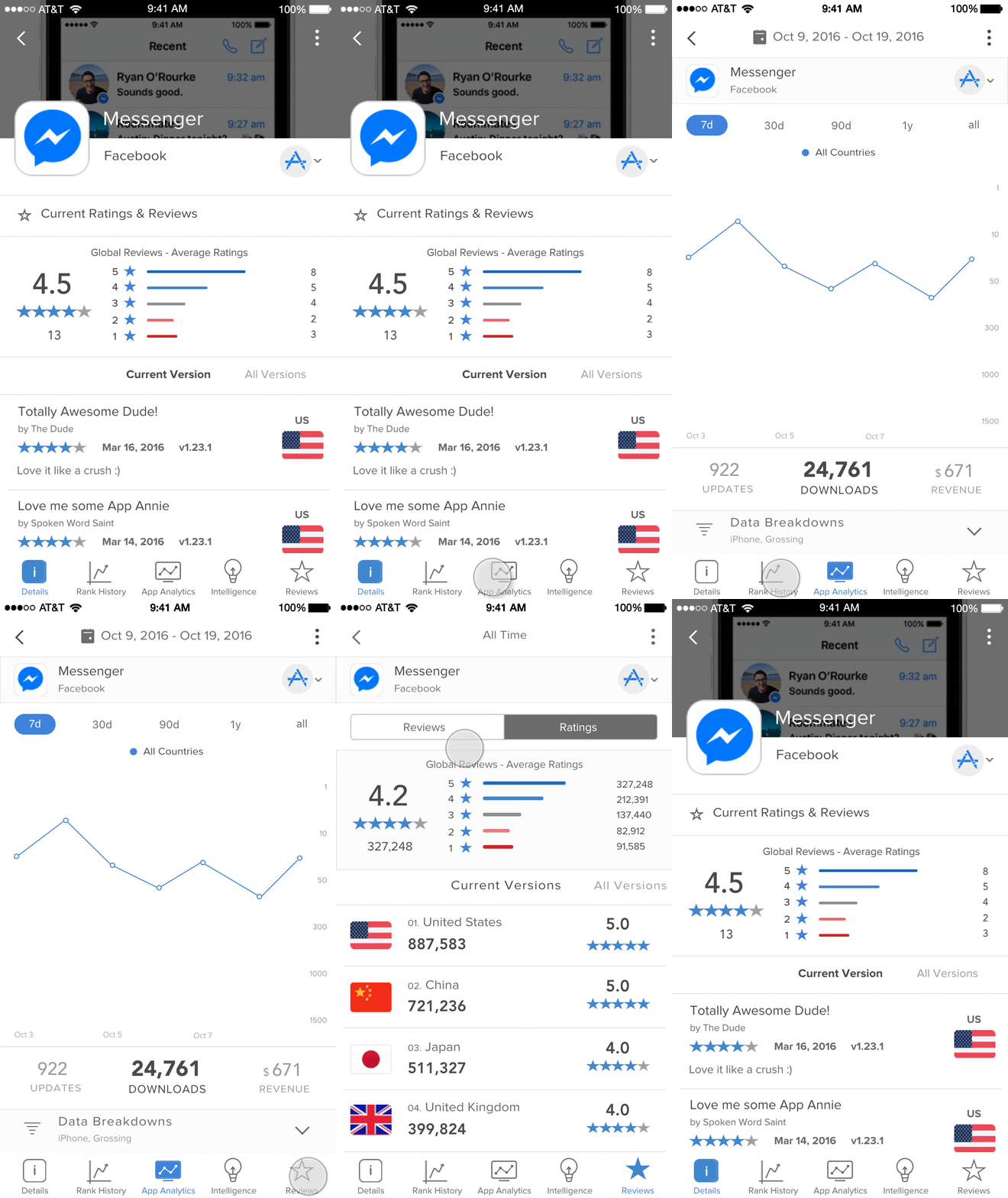
I proceeded to build on the prototype, addressing reviews/ratings, and the segmented metric screens. For ratings/reviews, I additional added a new filter pattern based on gestures that would be used where needed. Below is the original screen, and the proposal.
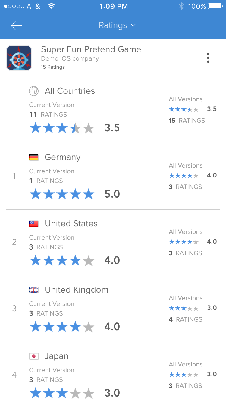
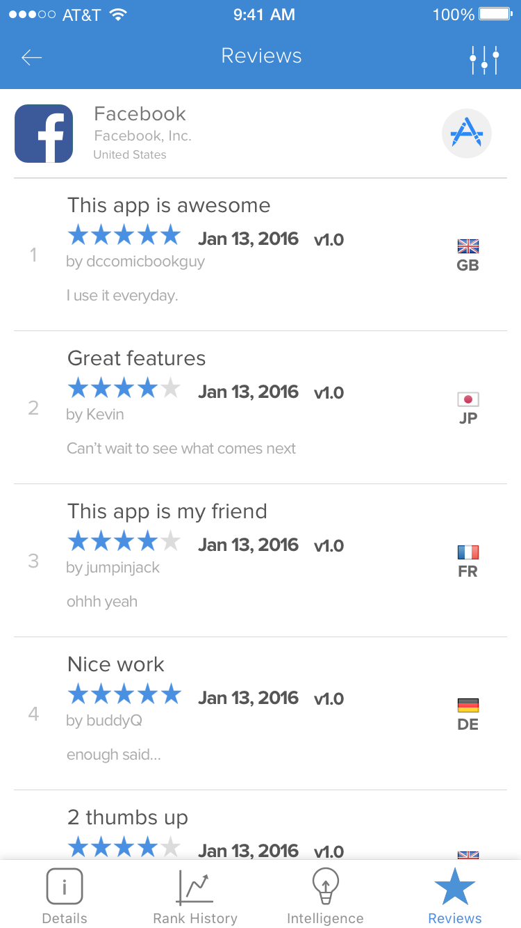
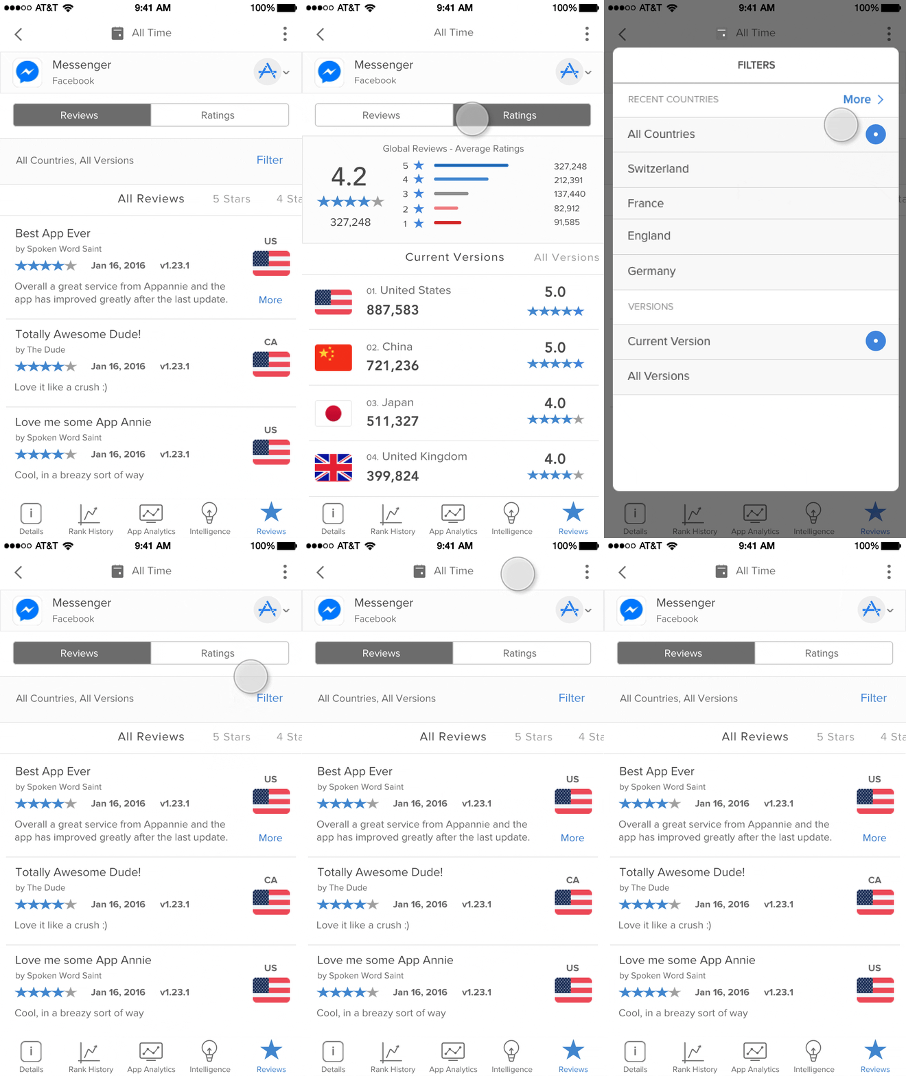
I then tested some ideas I had on how to revamp the segmented metric screens. There were 3 main screens, which all needed to support up to 20 metrics. I needed to create a pattern that worked well for all 3 screens, to reduce cost and improve the user experience. With feedback from users during the tabbed navigation project about the pain point of filters being too cubmersome, I attempted to move the date ranges out to the front. This would allow the users to select date ranges most commonly used, yet still select custom ranges if they wanted. You can see the original screens first, with the proposal following.
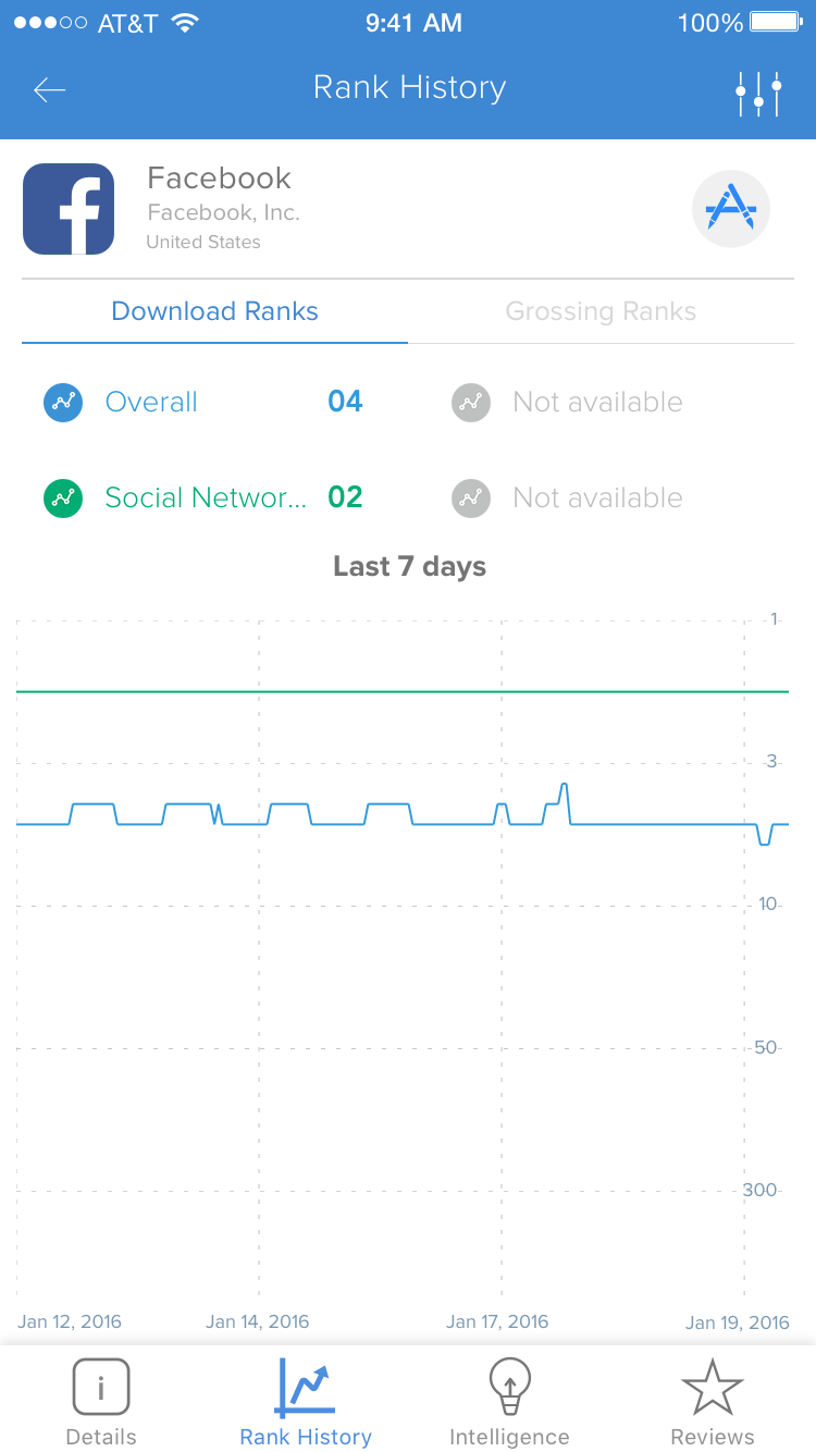
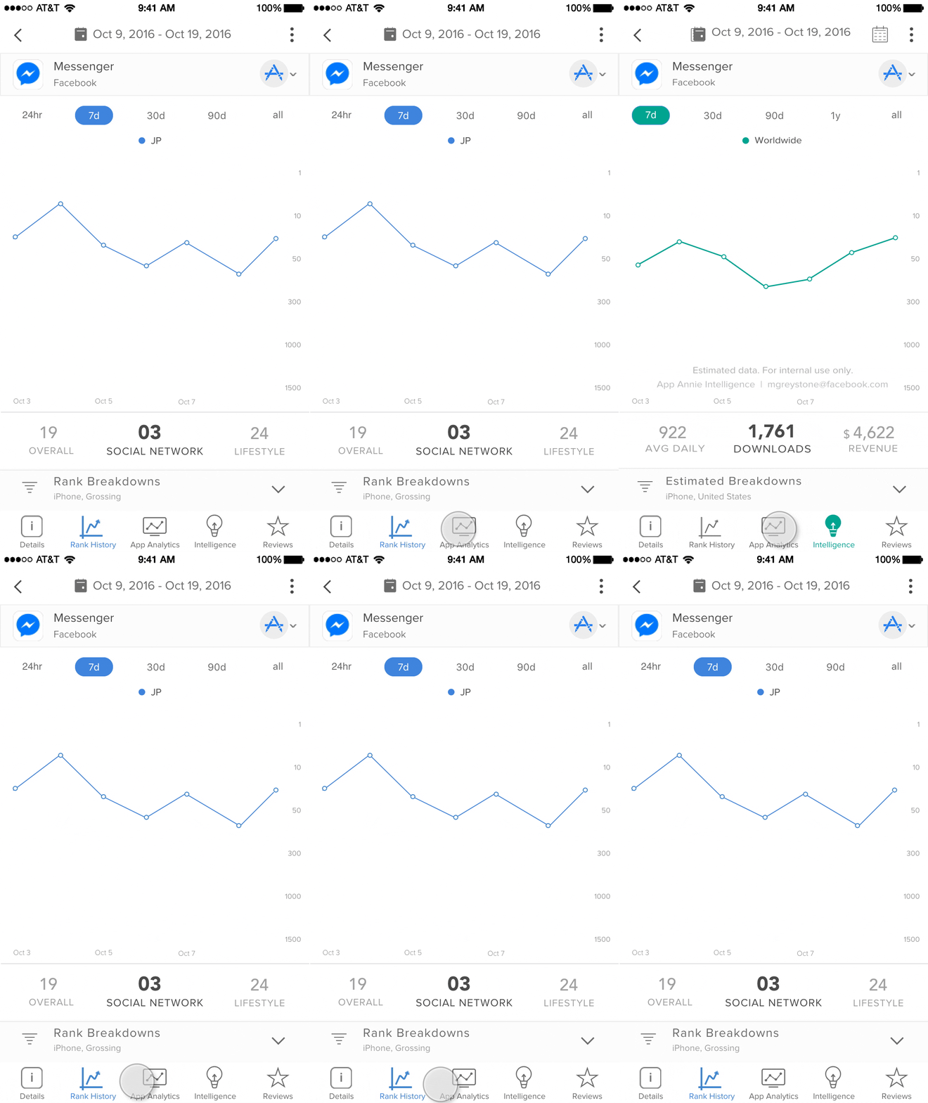
Again I tested these proposals with users by way of a moderated side by side A/B test, with the help of our UX Research team. With 12 users testing this prototype, all were in favor of the changes. Reviews and ratings received all positive comments. The main feedback came from the date range jumping while switching tabs on the metric screens. You will notice that "Rank History" contained a "24hr" pill, segmenting the data hourly. This was not available to metrics on the other screens. I needed to find a way to solve this problem, as I felt it may come up during release, and remain an issue.
Solution
I took this problem to engineering, with the proposal of moving the "24hr" data to the summary dashboard on the "App Details" screen. I felt this would be a nice area to check on hourly ranks quickly, which would cause more Daily Usage or our app. In previous A/B tests, users liked the idea of having it there. We planned to intially release with the "App Details" page containing details only. The metric screens would be complete with the date range pills consistent, removing "24hr". The "Reviews" screen combined with "Ratings" would ship as proposed, with additional plans in the future to translate the review text to different languages.
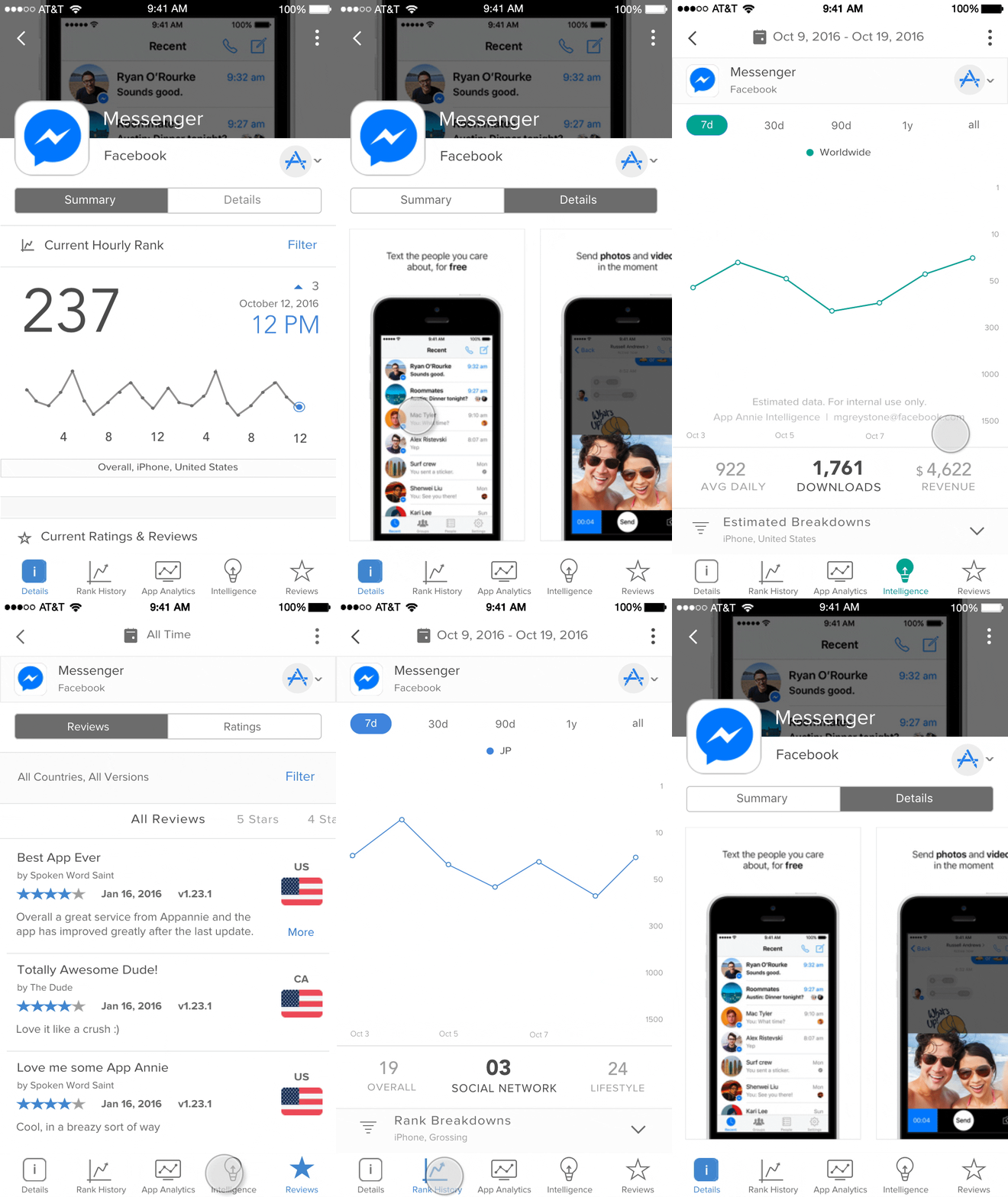 Initial launch showed big upticks in usage metrics. Monthly usage increased by 80%, Weekly 40%, Daily 5%. Screen views and time on screen increased over 60%, mainly on "Rank History" and "Reviews". We aquired 2,000+ new users, who were paying customers. There were some questions and comments around the "24hr" data being missing. I had to communicate to users that the feature would be added back in a few weeks in an improved state. Once the second release happened with the "Summary" dashboard, users were quite happy. It was reflected in the Daily Usage metrics rising 40%. I felt comfortable that we were attributing to our overall company retention goals.